This page will be made public upon completion.

Solar Polar Fields data from Wilcox Solar Observatory
NEW TERMINOLOGY:
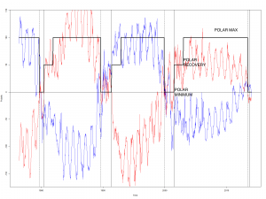
Polar Maximum – the years of most extreme polarity on the sun, correlating to what is commonly referred to as ‘solar minimum’ for the low number of sunspots. We see an indirect relationship between sunspots and polarity.
Polar Minimum – the years of polarity reversal on the sun, correlating to what is commonly referred to as ‘solar maximum for the high number of sunspots.
Polar Recovery – the first 3 mini cycles of each solar pole, or ~18 months following Polar Minimum, where the build-back to Polar Maximum is weakest and in the beginning process of ‘getting going’ for that cycle.
–Minicycles are the up and downs that happen about once a year during the solar cycle. You could consider them to be from peak to peak or trough to trough – it really does not matter.
Here you can see the Solar POLAR Cycles Identified by their terminology:

Credit: Ben Davidson & (Third Party Reserving Anonymity ATM)
Polar Color Code:
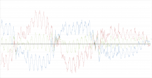
Blue: Solar North Polarity Curve
Red: Solar South Polarity Curve
Green (Simple Chart): Average Polarity
Purple (Advanced Chart Below): One way to measure Average polarity – Where it crosses the blue line, we have a polarity cancel for a net neutrality of solar polarity.
How to read the charts:
Polar Spikes – the peaks and troughs are often easy to see at polar maximum but they require closer examination near polar minimum, especially where hidden behind the forward colored lines of a correlated earthquake (we put the earthquakes on top of the polarity curves). These are important because they represent both the most extreme magnitude of polar force at the mini-cycle and a definitive change in the trend of the polar force.
Mini-spikes – these spikes are not the absolute peaks or troughs of the general up and down mini-cycles, which occur a number of times each 11 year solar cycle, but they are interruptions of those curves, and are surprisingly related to the +7.5 magnitude shaking (see intermediate video). These represent the same type of changes in magnetic trends seen at the peaks and troughs, and are also more disruptive to the ‘direction the polar fields are supposed to be going.
Polarity Reversal – or flip or switches etc., are when the North blue or South red lines cross the baseline and switch polarity, or when the average line switches in green or purple, on the simplified and advanced charts, respectively. When a pole or general average/total polarity of the sun changes, this represents a significant change.
Polarity Cancels/Net Neutrality – When the green line crosses the baseline (above) or when the blue line crosses the purple average line (advanced chart) that means that the red line absolute magnitude is equal to the blue at that time, and they cancel out the total polarity value on the star at that time. The sun is strongly magnetic and the forces at work dwarf anything we see on the planet earth- when N and S are equal distance from the baseline those massive forces cancel out for a brief period.
Introduction Video Click Here
Advanced Video Here:
This page is under construction – it will be visible to members only until completed.
Charts: These are the product of G. Puente De La Vega’s efforts to visualize the correlation between solar polarity and earthquakes- hypothesized on the Suspicious0bservers YouTube Channel on January 1, 2014. I would also like to thank Thomas Wirén for his contributions to this effort.
Earthquakes – common sense here, the big vertical spikes through the baseline are +8 magnitude while the smaller spikes are +7.5 and <8.0.
Solar Polarity data from Stanford comes in 10-day averages. Due to the periodicity of the data an earthquake spike may be up to 5 days off of its actual point on the graph. Such a change is imperceptible on the chart, and statistically insignificant as the analysis has nothing to do with the visualization. Solar images come from NASA and the ESA via the Solar Dynamics Observatory and the Solar and Heliospheric Observatory. The earthquake information comes. courtesy of the United States Geological Survey. Certain solar images were missing for relevant timeframes, and without the work of Dr. Tony Phillips at Spaceweather.com covering and cataloguing the relevant solar data since 2001, the coronal hole information would be incomplete even during the life periods of capable satellites.
These resources are free to share and be used to produce other works that further science.
Credit is requested as:
A Timeline of Solar Polar Field Strength Variations and Magnitude 7.5+ Earthquakes from 1976 to Present – by G. Puente De La Vega and Ben Davidson (2014)
Advanced Chart (Large File – Will not open quickly) Click to Open
This page is dedicated to the honor of Randy Schekman’s vow – Let the dominos fall…

